
[vc_row full_width="stretch_row_content_no_spaces" video_bg="yes" video_bg_url="https://www.youtube.com/watch?v=x61H4VDZRWg&feature=youtu.be" video_bg_parallax="content-moving" css=".vc_custom_1513467567194{padding-top: 100px !important;padding-bottom: 90px !important;background: #000000 url(http://www.adishaworks.com/wp-content/uploads/2016/11/pagny-cover-2.jpg?id=5449) !important;}"][vc_column][vc_column_text css_animation="top-to-bottom" el_class="sphd"]
HEALTHCARE RECRUITING WEBSITE UX & UI
[/vc_column_text][/vc_column][/vc_row][vc_row][vc_column width="1/2"][vc_empty_space height="60px"][vc_column_text css_animation="top-to-bottom" el_class="sphe"]
The Concept
[/vc_column_text][vc_separator][vc_column_text]
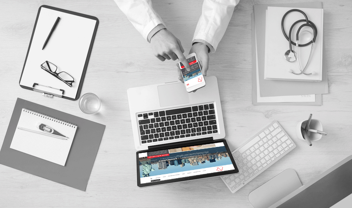
A physicians recruiting healthcare client engaged us to better communicate the organization’s brand stature. Most of all its purpose was to bring collaborative, efficient and compassionate healthcare to communities throughout the boroughs of New York. The website redesign was aimed to be mobile-optimized. This included incorporation of strategic SEO improvements in order to help support visibility and recruiting efforts.
The intent was to build an interface that was delightful, open and accessible for information forage. With consistent, engaging and strong brand presence, the platform has become a one-stop solution for physicians looking for jobs.
[/vc_column_text][/vc_column][vc_column reveal_effect="" width="1/2" css=".vc_custom_1513048934757{margin-top: 20px !important;}"][vc_empty_space height="50px"][vc_single_image image="5517" img_size="large" alignment="right" css_animation="right-to-left"][/vc_column][/vc_row][vc_row][vc_column][vc_empty_space][vc_column_text css_animation="top-to-bottom" el_class="sphe"]
DISCOVERY
[/vc_column_text][vc_separator][/vc_column][/vc_row][vc_row][vc_column width="1/2"][vc_column_text css_animation="top-to-bottom" el_class="sphe"]
STAKEHOLDER INSIGHTS
[/vc_column_text][vc_column_text]Workshops were conducted with the stakeholders. This helped in gathering insights on the purpose of this project. And so, their requirements became clear quickly:
Involve our target audience right form the start, thus create a banner video showing life of Physicians.
We want to make recruiting the highlight of all design decisions.
Being socially active is important to us. So, integrate our social media and newsletter stories on the website.
We would like visual balance for all text heavy page. In addition, make engaging call-to-action buttons.
Engage our visitors, therefore use animations and movement to build up the story.
In conclusion, focus on ‘advantages of working with us’ and our newly formed ‘research work’.
[/vc_column_text][/vc_column][vc_column width="1/2"][vc_column_text css_animation="top-to-bottom" el_class="sphe"]
PHYSICIAN INTERVIEWS
[/vc_column_text][vc_column_text]Physicians were interviewed to understand the key requirements for organic engagement. Questions were asked about what they were looking for in a recruiting website. Then amongst casual conversations, these insightful key came up:
I would like to see the advantages of working here in order for me to engage
Have a conversation with me, thus remove all formality barriers.
Make me feel safe when you are seeking my information
Probably for my interacting, build up my curiosity
While I am away from the website, connect and form trust with me with social media
Consequently, show me that I will be valued
[/vc_column_text][/vc_column][/vc_row][vc_row][vc_column reveal_effect="fadeInUp" width="1/2"][vc_column_text css_animation="left-to-right"]
Initial Wireframes and Sketches
[/vc_column_text][vc_single_image image="5480" img_size="large"][/vc_column][vc_column reveal_effect="fadeInUp" width="1/2"][vc_column_text css_animation="right-to-left"]
INTERFACE USER TESTING
[/vc_column_text][vc_video link="https://www.youtube.com/watch?v=yCl_01AWSoM&feature=youtu.be"][vc_column_text]The above animation shows the interaction of the user with the interface. The design thinking began with the incorporation of heuristics. Clear demarkations for banner videos, recruiting in a conversational tone and news and articles section for updates.[/vc_column_text][/vc_column][/vc_row][vc_row][vc_column][vc_empty_space][vc_column_text css_animation="top-to-bottom" el_class="sphe"]
INFORMATION ARCHITECTURE
[/vc_column_text][vc_separator][vc_column_text]
Sitemap
[/vc_column_text][vc_single_image image="5494" img_size="full" css_animation="bottom-to-top"][vc_empty_space][vc_column_text css_animation="top-to-bottom" el_class="sphe"]
User Interface Elements
[/vc_column_text][vc_separator][vc_column_text]
Color Palettes and Typography
[/vc_column_text][vc_single_image image="5515" img_size="full"][/vc_column][/vc_row][vc_row][vc_column][vc_column_text]
Responsive view of the Home Page
[/vc_column_text][vc_single_image image="5508" img_size="full" alignment="center" css_animation="bottom-to-top"][vc_column_text]The colors, typography, animation envelopes the information architecture. The site has been built on a mobile first approach. Imagery of New York, with brand messaging in a carousel, areas to promote physician recruiting, areas showing varied locations and updates in social media.[/vc_column_text][vc_single_image image="5529" img_size="full" alignment="center"][/vc_column][/vc_row][vc_row][vc_column][vc_column_text css_animation="top-to-bottom" el_class="sphe"]
Key learnings
[/vc_column_text][vc_column_text]As of today, phase one of the website is live, awaiting full rollout of the Physician B2B portal initiative sometime in 2018. The jury is still out on the effectiveness of the website, but certainly the collaboration process benefitted from this particular workflow. In addition to creating both an engaging and conversational design, we were also able to create frameworks which would be able to be used in other projects.
All in all, wireframes, specifications, prototypes-- basically all UX deliverables are communication tools. The key to proper collaboration is understanding the stakeholder needs and picking the right canvas for them.[/vc_column_text][vc_btn title="REQUEST TO VIEW LIVE SITE" style="outline-custom" outline_custom_color="#d6d6d6" outline_custom_hover_background="#000000" outline_custom_hover_text="#ffffff" align="center" link="url:http%3A%2F%2Fwww.adishaworks.com%2Felements%2Ficons%2Fcontact%2F|||"][/vc_column][/vc_row]